Guide
Complete Beginner's Guide
New to display specs? This complete beginners guide explains how to instantly check your screen size, resolution, and more with What Is My Screen Size.
Updated 2026-07-05
Understanding Your Screen Size: The Basics
If you have ever wondered what your real screen size is or why your display sometimes looks different than expected, you are not alone. Many people confuse the terms resolution, screen size, and viewport, often leading to mismatched settings or blurry visuals. Your screen size is more than just the physical measurement of your monitor. It is a combination of your device's hardware, your operating system's settings, and how your browser interprets these details.
This guide is designed for absolute beginners who want a straightforward approach to understanding their display. Whether you are troubleshooting scaling issues, planning to buy a new monitor, or just curious about your current setup, knowing your exact screen parameters is crucial. What Is My Screen Size is a free browser-based tool that instantly analyzes your display's specs, so you do not need to dig through menus or install any software.
The tool identifies your resolution, usable screen area, device pixel ratio, and aspect ratio, giving you a complete overview in seconds. This information is especially useful for gamers, designers, or anyone who wants to optimize their viewing experience. By understanding these terms, you will be better equipped to make smart hardware purchases, fix scaling problems, or just get the best performance from your system.
Screen Size, Resolution, and Viewport: How They Work Together
Screen size refers to the physical diagonal measurement of your display, usually in inches. However, your monitor's native resolution, which is the number of pixels it can display, often has a bigger impact on how things look. For example, a 24-inch monitor can have a resolution of 1920x1080 (Full HD) or even higher, affecting how sharp and spacious your screen feels.
The viewport is the area of your screen that your browser or operating system makes available to applications. This can be smaller than your full screen size due to toolbars, window borders, or display scaling. Device pixel ratio is another key term. It tells you how many device pixels correspond to one CSS pixel, which is important for web design and app development. When you open What Is My Screen Size, it analyzes all these parameters in real time.
Understanding the interplay between these specs is vital for tasks like setting up dual monitors, maximizing workspace, or ensuring content appears correctly on different devices. For instance, if your system uses display scaling to make text larger, your effective viewport shrinks even if your physical screen size stays the same. What Is My Screen Size helps reveal these details clearly, so you can make informed decisions and troubleshoot issues quickly.
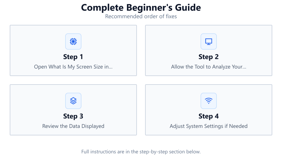
Step-by-step
Open What Is My Screen Size in Your Browser
Navigate to the What Is My Screen Size tool using your preferred web browser. No installation or sign-up is required, and it works on both desktop and mobile devices.
Allow the Tool to Analyze Your Display
When you load the page, the tool automatically detects your current screen resolution, viewport size, device pixel ratio, and aspect ratio. No manual input is needed.
Review the Data Displayed
Carefully read the summary provided on the screen. You will see your physical resolution, usable area (viewport), and device pixel ratio. Compare these numbers to your monitor's specs if you have them.
Adjust System Settings if Needed
If you notice discrepancies (for example, your viewport is much smaller than your screen resolution), check your operating system's display scaling or zoom settings. Adjust these to optimize clarity and workspace.
Use the Information for Upgrades or Troubleshooting
With your screen details in hand, you can decide if you need a monitor upgrade, adjust your workspace for productivity, or troubleshoot issues like blurry text. The tool gives you a reliable reference for making these decisions.
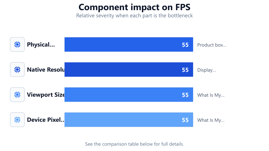
Comparison
| Screen Size Type | What It Means | Where to Find It |
|---|---|---|
| Physical Screen Size | Diagonal measurement in inches | Product box or monitor label |
| Native Resolution | Maximum pixel count your screen supports | Display settings or What Is My Screen Size |
| Viewport Size | Usable area for apps and browsers | What Is My Screen Size or browser dev tools |
| Device Pixel Ratio | Ratio of device pixels to CSS pixels | What Is My Screen Size or web inspector |
Common mistakes
Mistake
Confusing screen size with resolution
Fix: Remember that screen size is measured in inches, while resolution is the number of pixels displayed. Check both using What Is My Screen Size.
Mistake
Overlooking device pixel ratio
Fix: Device pixel ratio affects how sharp images and text appear. Always check this value in What Is My Screen Size before adjusting display settings.
Mistake
Ignoring viewport changes due to scaling
Fix: Operating system scaling can shrink your usable area. Use What Is My Screen Size to see the real viewport, then adjust scaling or browser zoom as needed.
Troubleshooting
Text and icons appear blurry
Likely cause: Display scaling or incorrect resolution settings
What to do: Check your resolution and scaling in system settings. Use What Is My Screen Size to verify your current values. Adjust scaling to a recommended level.
Websites look too small or too large
Likely cause: Browser zoom or device pixel ratio mismatch
What to do: Reset browser zoom to 100 percent. Compare device pixel ratio in What Is My Screen Size to your system’s recommended value.
Part of the screen is cut off or not usable
Likely cause: Viewport is smaller than expected due to toolbars or scaling
What to do: Close unnecessary toolbars and reset scaling. Use What Is My Screen Size to confirm the viewport matches your expectations.
Recommendations
- Use What Is My Screen Size regularly to monitor any display changes, especially after system updates.
- If you use multiple monitors, check each one individually with the tool to ensure consistent settings.
- When buying a new monitor, compare native resolution and device pixel ratio for the sharpest image.
- For web designers and developers, always test layouts at different viewport sizes using What Is My Screen Size.
Frequently asked questions
What is the difference between screen size and resolution?
Screen size is the physical measurement of your display, usually in inches. Resolution is the number of pixels your screen can display, such as 1920x1080. Both affect how content appears but measure different things.
Why does my usable screen area differ from my monitor's resolution?
Operating system scaling, window borders, and browser toolbars can reduce your actual usable area (viewport). What Is My Screen Size shows the real-time usable area.
How can I fix blurry text on my monitor?
Check your display scaling and resolution settings in your operating system. Use What Is My Screen Size to verify your display parameters, then adjust scaling for optimal clarity.
Is What Is My Screen Size safe to use?
Yes, it is a browser-based tool that does not require installation or collect personal data. It simply reads your display settings to show useful information.